from: A detailed guide to colours in data visualisation style guides
Outline
- colours for categories
- shades
- colours for common categories
- accent colours
- Grey
- Sequential and Diverging
Categories
Hues - Colour for categories
see: Use different hues to distinguish categories - Categorical colours
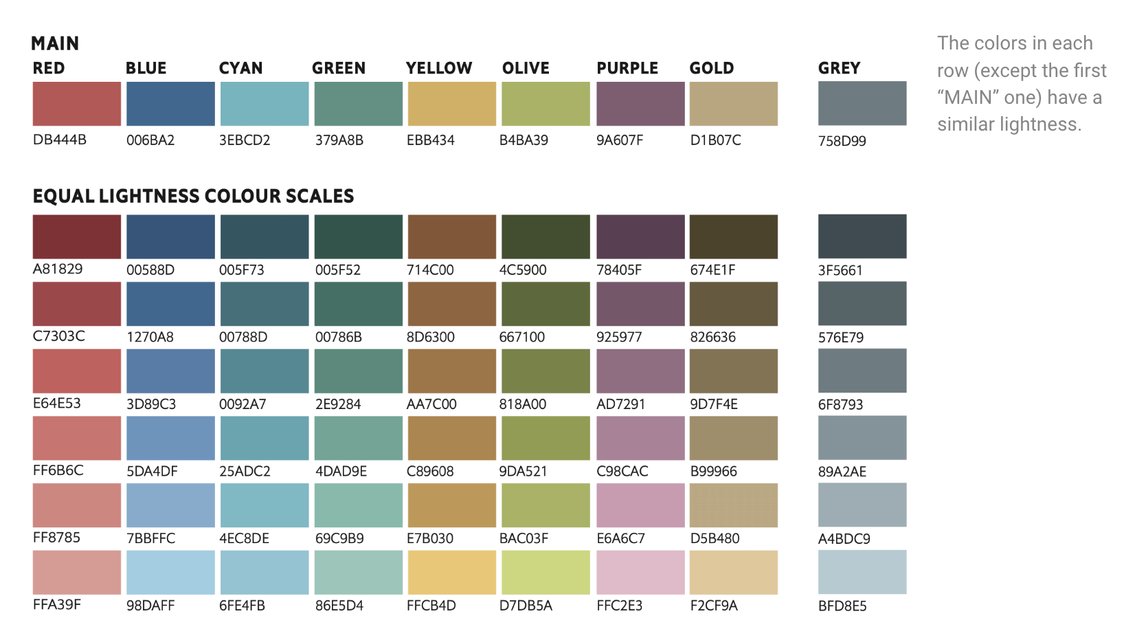
Shades - Colour for categories/sub categories
see: Also create lighter-darker version for a hue
also: How to create a colour scale for an arbitrary main colour by City of London Style Guide
Colour for common categories
eg male-female, missing data, positive-negative
Accent colours
- “primary colour” of the chart
- An accent colour is used for charts that just show one colour.
- “If more than one colour may be used to represent data, use one of the pre-defined categorical colour combos.” Datawrapper
Grey
- Grey for less important data - not too much saturation and should be perceived as grey
- Grey for everything not data
Sequential and Diverging colours
lightness range by Datawrapper
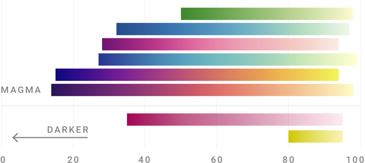
Diverging colour palette is basically 2 sequential scales glued together.
Equally lightness colours