Quick How to
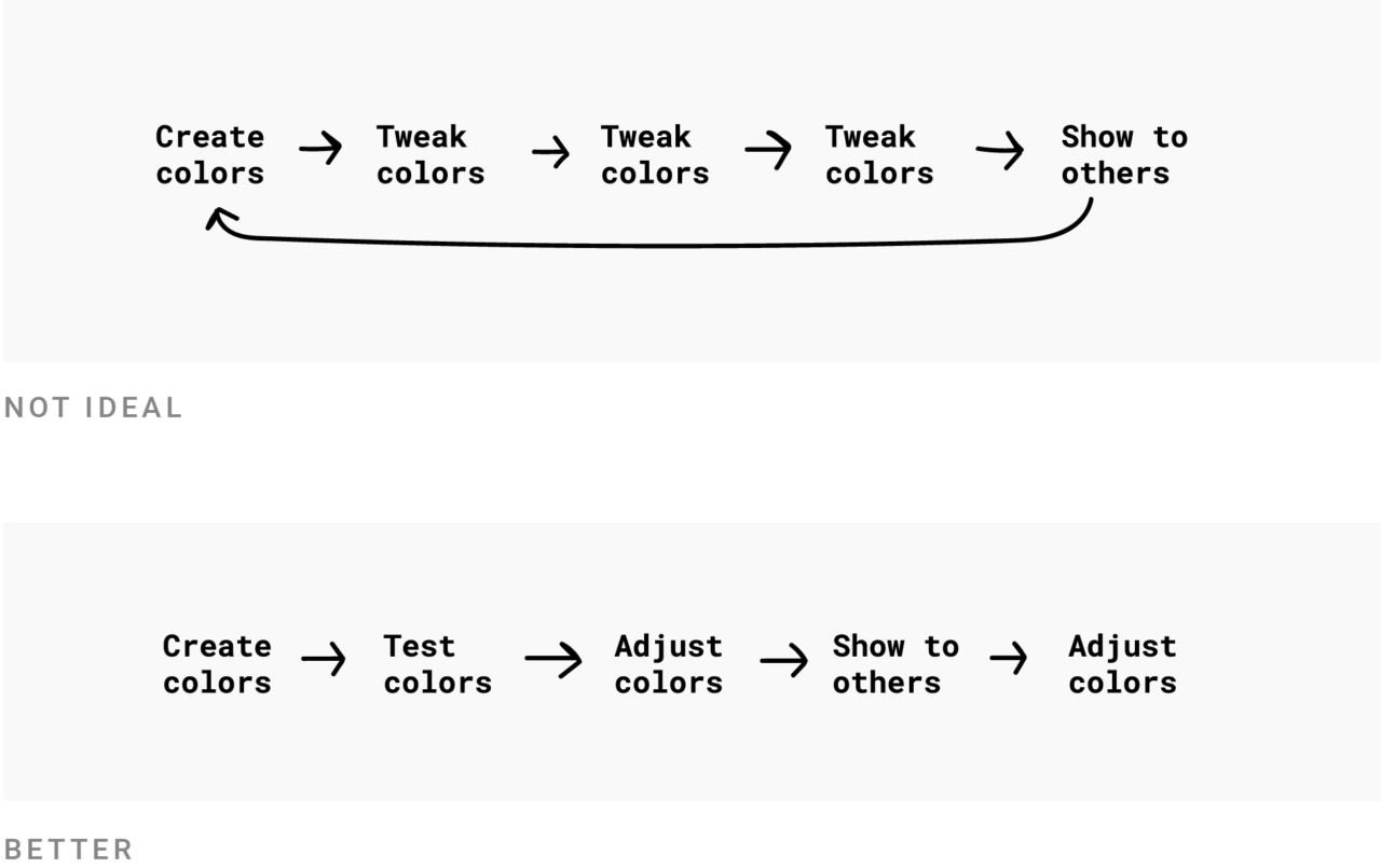
Pick 3-10 different colours - TRY to create some visualisation, If the colours don’t work after all, JUST CHANGE THEM.
Four different approaches
- Prepare for everything: City Intelligence Data Design Guidelines
- Fewer hues, more shades: FT, Economist
- More hues, fewer shades
- Minimalist
Prepare for Everything: very flexible palette
- example: City Intelligence Data Design Guidelines
- reason: Cover every use case
- ==Hues are almost always defined to be used in a certain order== (2 colours for City of London)
The Brand-ist: fewer hues, more shades
Colour brings life to chart - But too many colours can distract
Design director at Pew Research, Peter Bell, explained to me two years ago why the palette was that limited: “Our internal guidance is that ‘while color brings life to charts, too many colors can distract from the data. The best approach is to use shades of a single hue in most charts.’
More hues, fewer shades
- example: The Times(6 hues)
- This approach makes visualisations look more colourful than the brand-ist approach.
- compare with Brand-ist Approach
Minimal: Very limited colour palette
- example: McKensey(blue + neighbouring hues, eg purple)
Using only a small part of the colour wheel or only a few hues for lots of categories can bring problems with accessibility
Which colour to define?
Which colours to define for a data visualisation style guide
also see outline: Question - How to create or design a good colour palette?
Consideration when choosing colour
Considerations when choosing colour
How to create an organisational colour palette — some ideas
(organisational adj = having or showing the ability to arrange or organise things well)